R For Analytics: A Beginner’s Guide, Part 4
IMPORTANT: THE PACKAGE HAS BEEN UPDATED BUT ADAM HASN’T HAD TIME TO UPDATE THIS YET! PROCEED AT YOUR PERIL!
First, we had a look at different R libraries for Google Analytics, then we started using RGA, then we learnt how to get data out of GA using it. What now? Well, now I’m having to dig into the Big Pile Of Uni Notes I keep in my cupboard, because this is getting on for proper R stuff. I don’t want to stray too far outside the scope of this series, though, so I’ll try for a few easy-ish, relatively straightforward suggestions.
Let’s start with graphs! Who doesn’t love a good graph? It just so happens there’s a lovely R library called ggplot2 that does really excellent graphs of all shapes and sizes1. We’re probably best looking at a few specific graphs, so I’ll go for bar graphs, pie charts and line graphs (and scatterplots too, but not with ggplot2)
install.packages("ggplot2")
There are a few things you need to watch out for, as the library is designed for analysing big data sets, and some things that you might think should be simple can be a bit more complicated than you might imagine. For instance, some methods assume by default that the data needs binning and gets rather confused. I’ll try to point out where I’ve managed to dodge things like that, but StackOverflow and the like are full of clever folk with solutions to problems like yours, so if you encounter something unexpected, you should be able to find a solution.
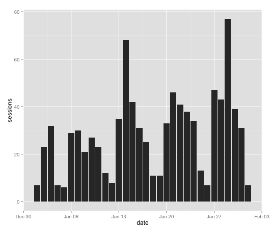
You make a bar chart like this
ggplot(ga_data,aes(x=date,y=sessions)) + geom_bar(stat="identity")
where “ga_data” is the data set you’re using for the graph, x and y are (obviously) x and y and stat=“identity” means it’s using the values as-given rather than trying to bin stuff. It gives us an output like this:
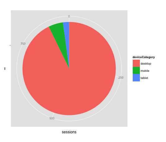
Next, pie charts – they’re a little funny, because they’re constructed as bar charts, but mapped in polar co-ordinates (further reading on that [here](http://mathworld.wolfram.com/PolarCoordinates.html), but if you don’t know/care, just go with it)
pie <- ggplot(device_cat_jan, aes(x = "", y = sessions, fill = deviceCategory)) + geom_bar(width = 1, stat = "identity")

pie + coord_polar(theta = "y")
So you want “y” to be whatever the metric is (sessions, transactions, whatever) and “fill” to be whatever the dimension is (here it’s device category).
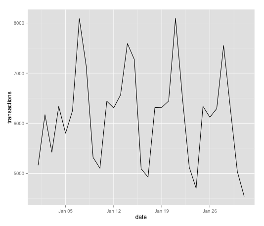
Line graphs are pretty easy, similar to bar charts:
line_plot <- ggplot(transactions_2015, aes(x=date, y=transactions))

line_plot + geom_line()
So, graphs are pretty straightforward. We can also test the correlation of two continuous sets of data, using Pearson’s product-moment correlation coefficient, which is like Bigby’s Icy Grasp but for correlation rather than for creating magical floating hands of ice. Also, an at-will, not a daily power. Um. Where was I? Oh yeah. The input will be something like this:
with(sess_ad, cor.test(sessions, adCost))
(we’re doing the correlation between sessions and ad cost) and the output will look something like:
Pearson's product-moment correlation
data: sessions and adCost

t = 21.4583, df = 333, p-value < 2.2e-16

alternative hypothesis: true correlation is not equal to 0

95 percent confidence interval:

0.7128185 0.8033630

sample estimates:

cor

0.7617863
Relevant value here is that last one, which ranges from -1 (totally negatively linearly related) to +1 (totally positively linearly related). 0 would be no correlation at all – so you can see that, with a value of ~.76, ad cost and sessions are pretty strongly correlated.
You might also want to try some linear regression. Haven’t heard of linear regression? It’s not actually all that complicated, it’s just modelling the relationship between two (or more) variables. The formula is “lm(y ~ x)” where y is the dependent variable, and x is the independent variable, or in English, y is the variable whose change is predicted by x.
fit <- lm(sessions ~ adCost, data=sess_ad)

summary(fit)
So, say we wanted to look at the relationship between sessions and ad spend again, to see how well one predicts the other, and if we can model that. Here, “sessions” would be the dependent variable, and ad cost the independent variable – because we want to see how sessions vary with ad cost.
Call:

lm(formula = sessions ~ adCost, data = sess_ad)
Residuals:

Min 1Q Median 3Q Max

-4516.7 -1029.6 -326.1 908.6 10545.4
Coefficients:

Estimate Std. Error t value Pr(>|t|)

(Intercept) 4.018e+03 2.713e+02 14.81 <2e-16 ***

adCost 3.910e-01 1.822e-02 21.46 <2e-16 ***

---

Signif. codes: 0 ‘***’ 0.001 ‘**’ 0.01 ‘*’ 0.05 ‘.’ 0.1 ‘ ’ 1
Residual standard error: 1656 on 333 degrees of freedom

Multiple R-squared: 0.5803, Adjusted R-squared: 0.5791

F-statistic: 460.5 on 1 and 333 DF, p-value: < 2.2e-16
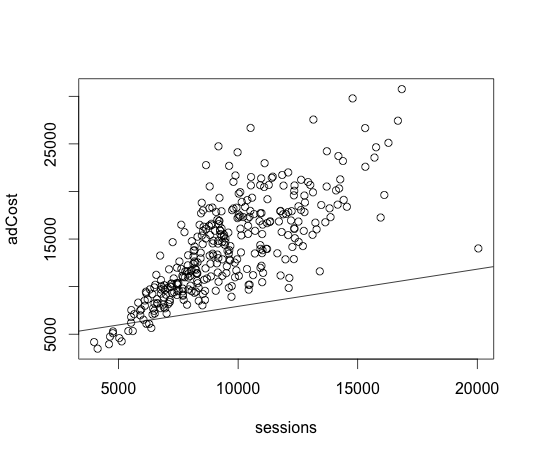
Relevant value here is the multiple R-squared value, which tells you how well x predicts y, with values from 0 (not at all) to 1.0 (perfectly). A value of ~.58 would suggest that it’s a decent, but not great predictor. We can graph this on a scatterplot too:
plot(sessions,adCost)

> abline(lm(sessions~adCost))
Other things you can use to determine how good the model is plotting
> plot(fit)
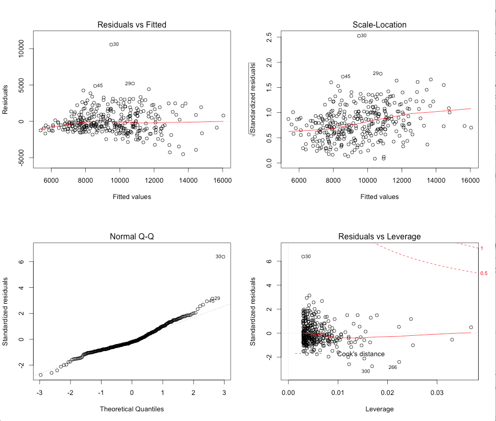
What you’re looking for here is the top-left (residuals vs fits) plot to have the points be randomly distributed, and the bottom-left (Q-Q plot) to be ‘normal’ (follow the diagonal as closely as possible). Our example here isn’t bad, but it still looks like the model has some issues.
The equation itself can be found by entering
coefficients(fit)
which gives
(Intercept) adCost

4017.9343547 0.3910074
and the equation therefore takes the form
sessions = 4017.93 + adCost*0.39
Which probably isn’t that reliable a model, but it’s a start. If you wanted to increase the accuracy, you could start modifying the values with logs, polynomials, etc – or possibly even go into other types of regression – nonlinear or multivariate, but that’s slightly above the pay grade of this article. If you’re looking for further reading, there’s a wealth of information on this stuff online – start with something like this and investigate from there (yes, I am telling you to google it, I’ve exhausted myself writing and editing this). This is the final post in the series – there will be a recap/master reference post at some point, and possibly also some follow-up, but for now, thank you very much for reading, and good luck using R!
1. it is possible to do graphs without ggplot2 – even, in some cases, more easily – but ggplot2 is, in my opinion, more versatile when you try to do more complicated stuff. Also, it’s what I was taught, and I’m the one writing the tutorial.↩

Subscribe to our newsletter:
Further reading

Backing up Universal Analytics data in BigQuery

How to deal with the GA4 Data API quota limitations in Looker Studio