You can't buy data strength. You build it.
Google made data strength central at GML 2026. But it is not a setting you switch on. Here is what actually builds it: consent, server-side, and a warehouse.
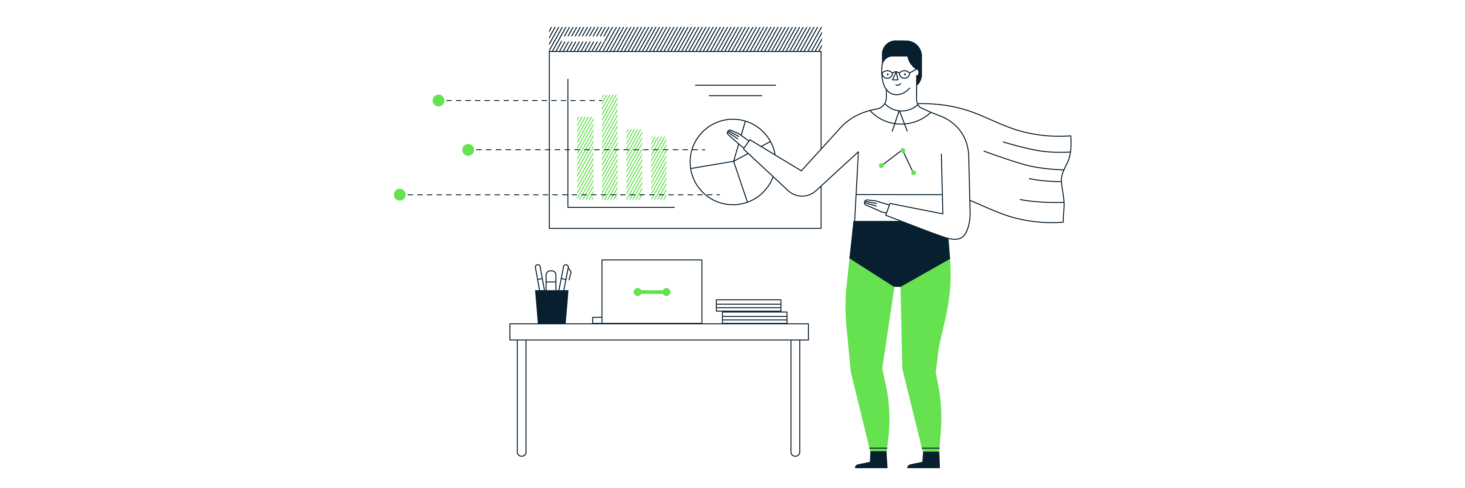
Mark Rochefort•21 Jun 2026
This blog post is a brief introduction to Plotly Dash and a short tutorial to learn how to build a custom visualisation. For this tutorial, you will need some basic knowledge of Python, HTML and JavaScript.
This article will focus on locally building and visualising your graph.
Let’s start with the basics: what is Plotly Dash? Dash is a Python framework created by Plotly to render interactive dashboards which can also be hosted online, by using just Python. Dash has both an enterprise and an open-source version, we’re going to be using the latter.
Dash is built on top of Flask, Plotly.js and React.js. So that means you don’t need to have extensive knowledge of HTML, CSS and JavaScript, but a basic understanding should be enough to build some visualisations.
There are many advantages of using Plotly Dash, but the three main advantages are:
For this tutorial I used a dataset I found on Kaggle which contains the “Top 1000 IMDB Movies” on which I performed some data transformation with Pandas (i.e. dropping columns, data type changes, etc.).
In this tutorial, we’re going to build a bar chart with a dropdown menu where we’ll filter the movies by year.
As a prerequisite to creating your Plotly Dash app, you’ll need first to set up your local environment, so create a new directory where you’ll store the code and set up the virtual environment.
Check if the file needs cleaning. For this specific file, I performed some data transformation, but this won’t be part of this tutorial.
Install Dash, Plotly Express and Pandas. For this tutorial, we’re going to use python3.
pip3 install dash plotly-express pandasLet’s start by creating an empty file named app.py in the root directory of your project. Save the data in the root directory as well. Below is how your project should be structured.
top_1000_imdb_movies/
|
├── venv/
|
├── app.py
|
└── movies.csv
In app.py import the dependencies
From GA4 implementation to server-side tagging and consent management — we'll make sure your data is accurate and complete.
# Import packagesfrom dash import Dash, html, dcc, Input, Output
import plotly.express as px
import pandas as pd
Read your data with Pandas:
# Read data
df = pd.read_csv("movies.csv")
To initialise our app we use this code snippet. This is known as the Dash constructor.
app = Dash(__name__)The next part we’re going to add is known as the layout which represents the app components that will be displayed in the browser, from basic HTML components like divs (html.Div) to complex Dash components like dropdowns (dcc.Dropdown). The layout consists of a tree of components such as html.Div and dcc.Graph.
app.layout = html.Div([
    html.H1('Top 1000 IMDB Movies'),
    html.H4('Gross profit by year'),
    dcc.Dropdown(
        id="dropdown",
        options=df['Released_Year'],
        value=df['Released_Year'][0],
        clearable=False
    ),
    dcc.Graph(id="graph")
])
Let’s have a closer look at the elements in our code:
html.H1 and html.H4 are HTML tags that will generate for example <h1>Top 1000 IMDB Movies<h1> element in the app.dcc.Dropdown is a Dash Core component used to generate the dropdown menu. This component comes with an option (the list options, in this case, the release year of the movie) and a value (the initial default value in the dropdown).True on all dcc.Dropdown components. I set it to False to prevent the clearing of the selected dropdown value.dcc.Graph is another component that renders the data visualisation, the bar chart in this case.We have defined how our components will be rendered. Time to make our app dynamic. To do so, we’re going to use callback functions. These functions are automatically called by Dash every time an input component’s property changes. In this case, data filtering will trigger the callback function and an output will be returned. So basically a callback function links the inputs and outputs of our App.
@app.callback(
    Output("graph", "figure"),
    Input("dropdown", "value")
)
Every time we change the input, Released_Year in this case, our graph will be updated.
Time to wrap up everything. This last function will help us to create and update the bar chart.
def update_bar_chart(year):
    release_year = df["Released_Year"] == year
    fig = px.bar(df[release_year], x="Movie Title", y="Gross Profit",
                barmode="group", text_auto='.2s')
return figrelease_year = df["Released_Year"] == year we’re setting the value of the df column "Released_Year" to the argument yearTo complete the tutorial, we need to add a last part of the code that allows us to run the App.
if __name__ == '__main__':
    app.run_server(debug=True)
To run our App you run this command python app.py
This should be the final result:
Congrats! You’ve just built your first Plotly Dash chart. This is the first step toward creating interactive and fully customizable applications.
If you’d like to learn more about our custom charts services with Plotly Dash, feel free to contact us.
From GA4 implementation to server-side tagging and consent management — we'll make sure your data is accurate and complete.
Our instant analytics audit scans your GA4 configuration and flags what's missing, broken or misconfigured.
Google made data strength central at GML 2026. But it is not a setting you switch on. Here is what actually builds it: consent, server-side, and a warehouse.
Dara and Matthew recap 2025 with 12 top highlights, AI, analytics, and the best moments on The Measure Pod.
AI expert Daniel Hulme, founder of Satalia, shares his journey from UCL PhD to entrepreneur, discussing AI, consciousness & deep tech.