Clearing 2026: why UK universities need recruitment intelligence
UK universities face a deficit crisis. Student Recruitment Intelligence can transform Clearing from chaos to precision.
Steven Elliott•6 Feb 2026

The real-time report in Google Aanalytics 4 (and Universal Analytics for that matter) has always been something that I’ve described as “interesting, but not very useful” - and I stand by that. However, that doesn’t mean it’s of no use, and not without its merits. But before we get into how to use it, we have to mention what data it’s showing, as well as some caveats and considerations.
Firstly, it shows only data from the last rolling 30 minutes - once it’s gone, it’s gone. That is until the next day in which it’ll appear in all the regular reports as normal.
Secondly, it’s called real-time, but there can be a delay of up to a few minutes for data to get from the user's device to this report - especially for iOS and Android apps. This may not sound too bad, but if you ever need real-time data, you need it in real time. Imagine for example if you had to wait a few minutes every time you used your card to pay for something in a shop, you’d get pretty annoyed.
Lastly, and it almost goes without saying nowadays, it only shows data from users that have GA cookies (or equivalent app identifiers) - i.e. consent users only. That is until 8th December 2022 when GA4 introduced behavioural modelling into its real-time data. But to see any behavioural modelling in any of your reports, you’ll need to be using Consent Mode. Check out episode #42 of The Measure Pod podcast on Consent Mode and behavioural modelling for more details on what it is and how it all works.
Now that the foundation has been laid, let’s look at what it can do!
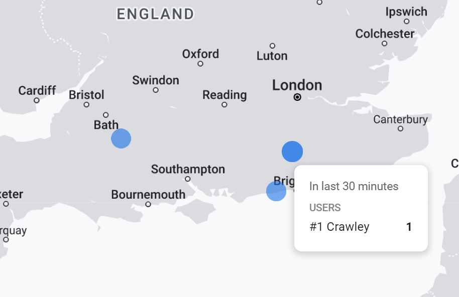
It is what it is, an interactive map. It shows the geographical location of your users that have visit your site/app in the last 30 minutes
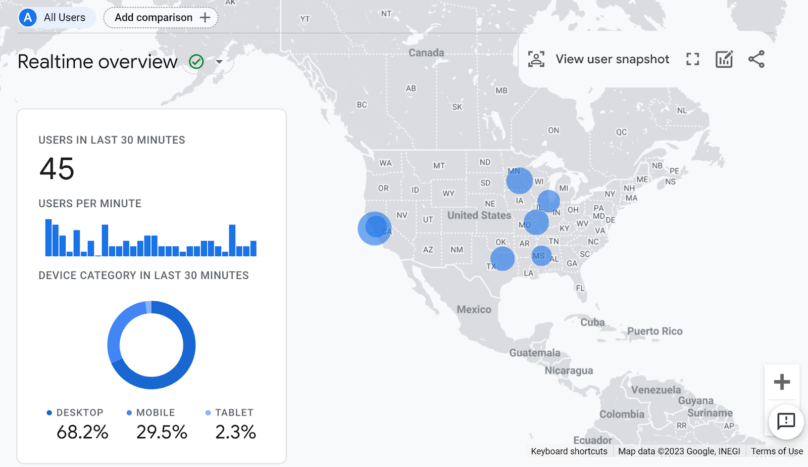
It shows data down to the city level, and you can pan and zoom using your cursor and/or the +/- icons to the right of the map.
From GA4 implementation to server-side tagging and consent management — we'll make sure your data is accurate and complete.
Out of all of the smaller charts underneath the map, the two that I find myself using time and time again is the ‘Views by Page title and screen name’ and ‘Event count by Event name’ ones:
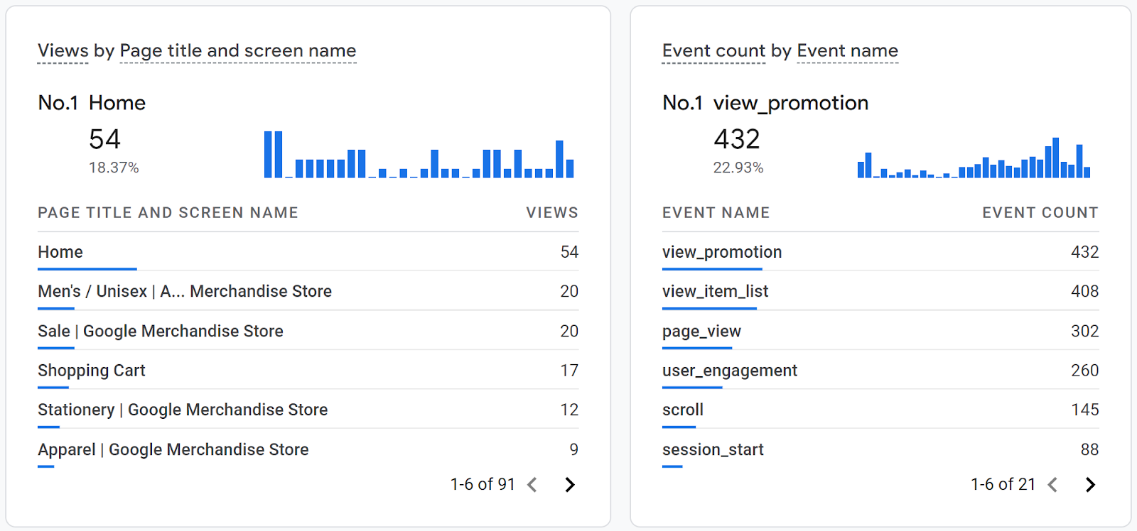
Fundamentally, this shows what web pages and app screens are being looked at, and the total count of events. The latter is very useful if you’ve just pushed some new event tracking live, and want to see it come through in real-time. Logging the events yourself and seeing them appear here almost immediately is a good basic way to QA the tracking implementation.
At the top right of the real-time report, you’ll see a link button to ‘View user snapshot’:
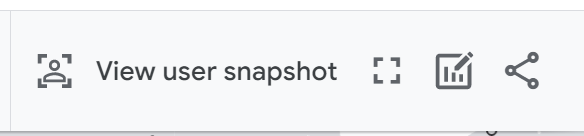
Clicking this then opens up the user snapshot screen, where it picks one user that has been on the app/site in the last 30 minutes at random and shows you their activity stream:
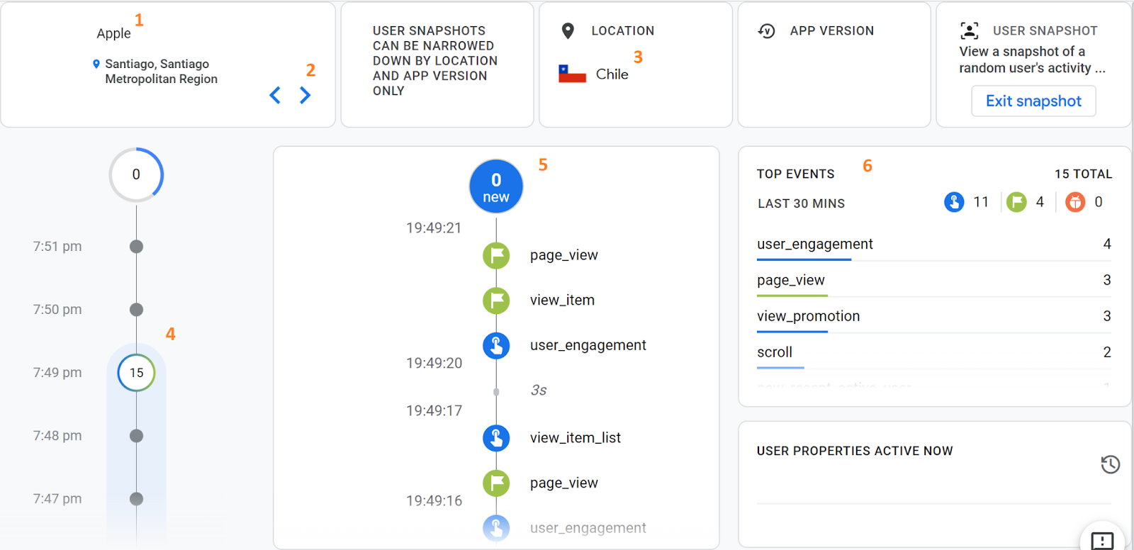
In this screen, there’s a lot of information to look at, starting with the user’s device (1) and country they are browsing from (3). There is a macro timeline (4) and micro timeline (5) showing all of the events the user has logged with their timestamps, and then a summary of the total events they have logged in the last 30 minutes (6). If you want to cycle through to another user, you can use the toggle at the top left of the screen (2).
Clicking on any event in the micro timeline (5) opens up another panel in which you can see all of the event’s parameters:
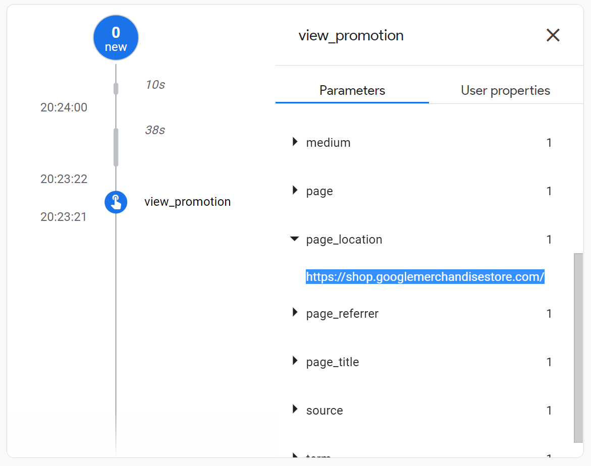
For example in the above screenshot, we have selected the ‘view_promotion’ event and opened up the ‘page_location’ parameter to see that this event was logged on the homepage.
If you’ve read this and think that it would be great to be able to pick out a specific device (i.e. your own) for QA, then you can with the DebugView report! The DebugView report is basically the same thing as the user snapshot, but for specific devices that have been identified.
From GA4 implementation to server-side tagging and consent management — we'll make sure your data is accurate and complete.
Our instant analytics audit scans your GA4 configuration and flags what's missing, broken or misconfigured.
UK universities face a deficit crisis. Student Recruitment Intelligence can transform Clearing from chaos to precision.
Dara and Matthew recap 2025 with 12 top highlights, AI, analytics, and the best moments on The Measure Pod.
AI expert Daniel Hulme, founder of Satalia, shares his journey from UCL PhD to entrepreneur, discussing AI, consciousness & deep tech.